Rentspree Tenant Screening Revamp


Research & Insights
User Research
We conducted qualitative interviews with 12 recent applicants and analyzed quantitative funnel data from the past year.
Key Findings:
Perceived Length & Complexity:
Users described the application as “never-ending” and “too detailed for an initial rental inquiry.”Mobile Friction:
65% of users reported struggling with input fields, scrolling, and navigation on mobile devices.Redundant Questions:
Several questions asked for information already provided in previous steps (e.g., employer details, contact info).Unclear Progress Indicators:
Applicants weren’t sure how much was left, increasing drop-offs mid-way.Trust & Privacy Concerns:
Users were hesitant to share sensitive info (like SSNs or bank details) before understanding how data would be used.
Competitive Analysis
We benchmarked 5+ competitor apps (Zillow, Avail, Turbotenant and Apartments.com).
.
Redesign Strategy
As a step 1, we Audited the Existing Flow step by step for Performance and Friction
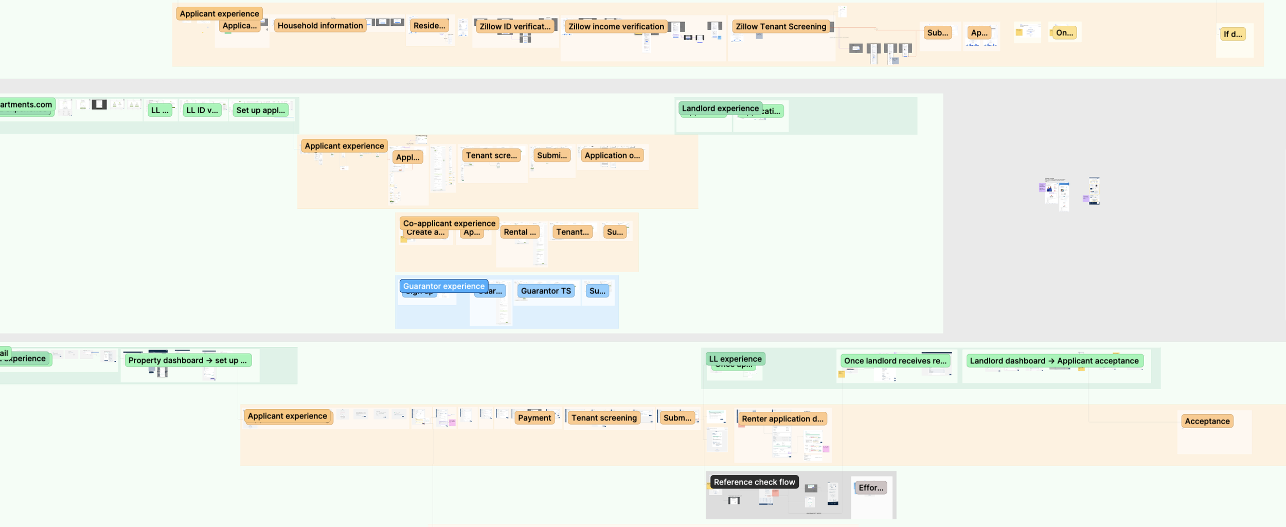
We began by reviewing the end-to-end application flow to understand how users progressed through each step.
Mapped the full flow from entry to submission
Identified stages with lower completion or higher abandonment
Flagged steps that introduced unnecessary complexity or repetition
This allowed us to pinpoint where the flow needed structural changes rather than surface-level fixes.
Analyzing the existing application and rethinking the questionnaire logic

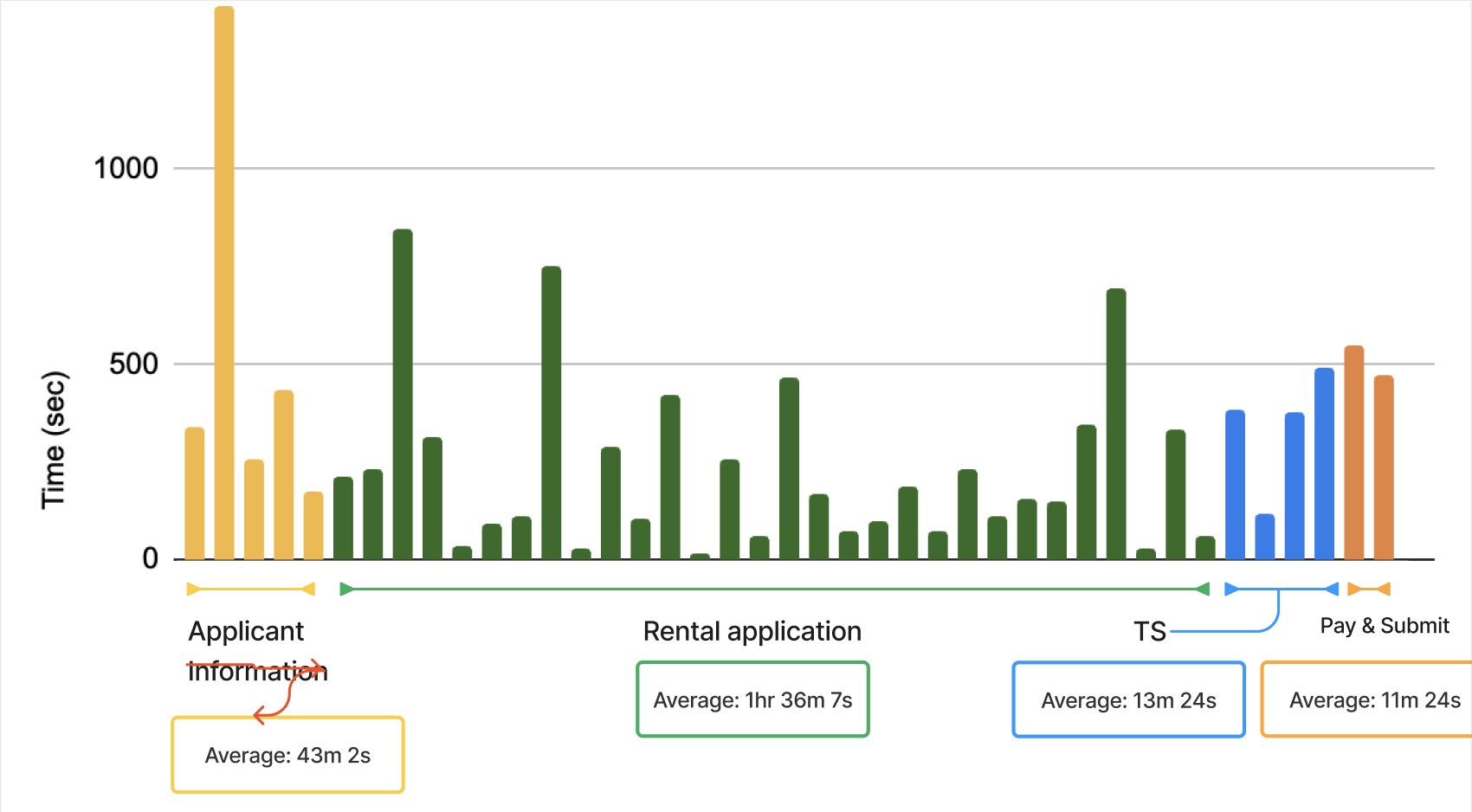
Part 1: Applicant Information

Part 2: Rental Application

Part 3: Tenant Screening

Part 4: Pay and Submit

Design Approach
1. Simplification of Content
Audited all 98 questions with PMs and Legal to identify unnecessary or repetitive fields.
Reduced total questions by 32% (to 67).
Grouped related questions (e.g., income + employment + references) into concise modules.
2. Progressive Disclosure
Introduced contextual step logic so users only see questions relevant to their answers (e.g., co-signer info appears only if “Yes” is selected).
Reduced visible form length on mobile by 40%.
3. Mobile-First Design Update
Rebuilt form components for mobile usability:
Larger tap targets and autofill support
Persistent progress bar
Sticky “Save & Continue” CTA
Real-time validation with in-line feedback
Updated typography and spacing using the new design system (DS v2) for consistency and accessibility.
4. Visual Feedback & Trust Signals
Added micro-interactions for form completion (“Step complete!”).
Included clear privacy explanations at data-sensitive steps to build trust.
5. Smart Save & Resume
Implemented auto-save and re-entry checkpoints to reduce frustration for users interrupted mid-process.

Simplified and Reordered the Flow
Based on the audit, the overall structure of the application was streamlined.
Reduced the number of steps where possible
Combined related inputs to minimize context switching
Reordered steps to better match user expectations and mental models
These changes helped maintain momentum and reduced drop-off caused by perceived effort.
Restructuring and Dividing the questions

Simplified and Reordered the Flow
Based on the audit, we streamlined the overall structure of the application.
Reduced the number of steps
Combined related inputs to minimize context switching
Reordered steps to better match user expectations and mental models
Reduced Time and Effort per Step
We optimized individual interactions to make each step faster and easier to complete.
Removed redundant inputs and confirmations
Improved input validation to prevent errors before submission
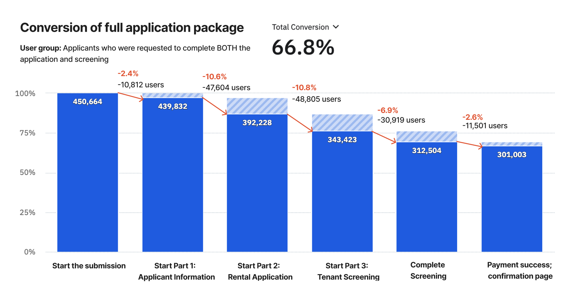
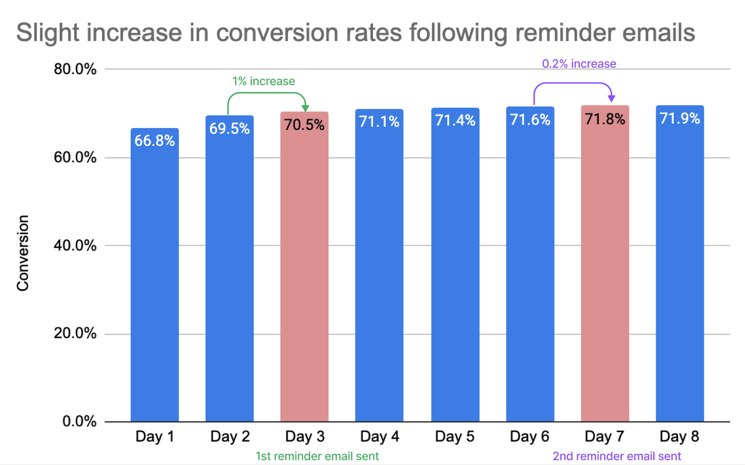
Based on the prototype testing, this lowered cognitive load by and shortened time on task ~7-11 mins without sacrificing clarity.
Clarified Progress and System Feedback
Made progress more explicit at each stage
Provided immediate feedback for user actions
Set clear expectations around loading and processing states
Updated Web Flow
Designed Mobile-First and Adapted for Scale
Given that most users accessed the flow on mobile, we prioritized mobile usability throughout the redesign.
Optimized layouts for smaller screens
Improved touch target sizing and spacing
Mobile Flow
